Share this
The Evolution of the Starbucks Logo: A History from 1971 to Today
by Logomaster Team on Apr 26, 2023
Few symbols are as globally recognized as the Starbucks logo, an emblem of a brand synonymous with exceptional coffee and an unparalleled cafe experience. Delving into the history and evolution of the Starbucks logo offers valuable insights into the brand's identity, as well as its influence on design, branding, and popular culture. In this article, we invite you to embark on a captivating journey, exploring the Starbucks logo's transformation from its inception in 1971 to the iconic image we all know and love today.
Birth of an Icon: The Original Starbucks Logo (1971)
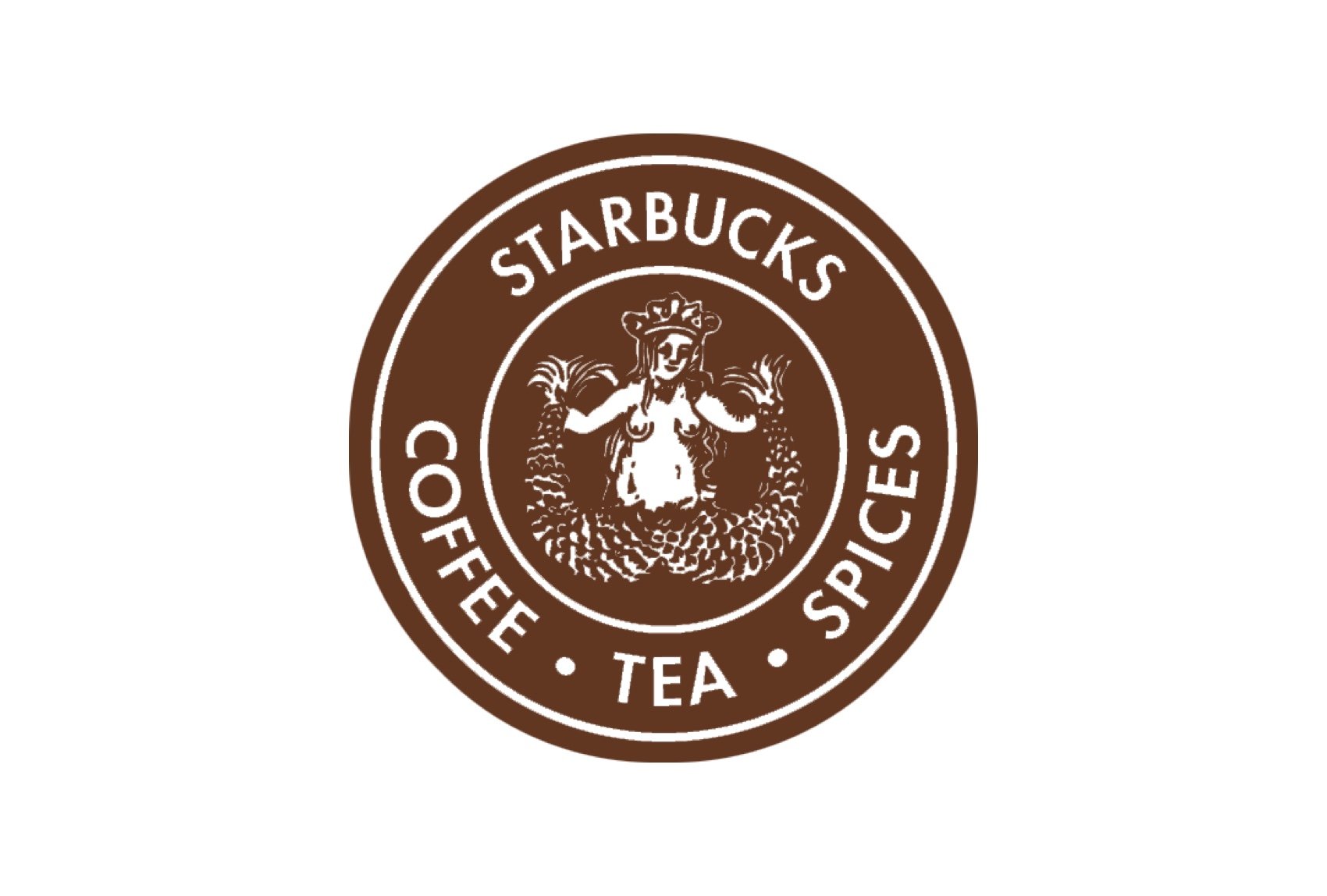
When Starbucks was first established in 1971, its founders chose a logo that reflected the company's maritime roots in Seattle. The original logo design featured a two-tailed mermaid, or siren, surrounded by a circular frame with the words "Starbucks Coffee, Tea, and Spices" written around it.
The inspiration behind the two-tailed mermaid comes from Greek mythology, where sirens were known to lure sailors with their enchanting songs. The founders believed that the siren symbolized the seductive allure of their coffee, captivating consumers with its irresistible aroma and taste.
In its initial iteration, the Starbucks logo was more detailed and visually complex than the current version. The siren was depicted with a fully exposed, double-fishtailed lower body and long, flowing hair, giving the design an intricate and artistic appearance. The color scheme of the original logo was brown, reflecting the brand's focus on coffee and natural ingredients.
A Bold Transformation: First Major Evolution (1987)
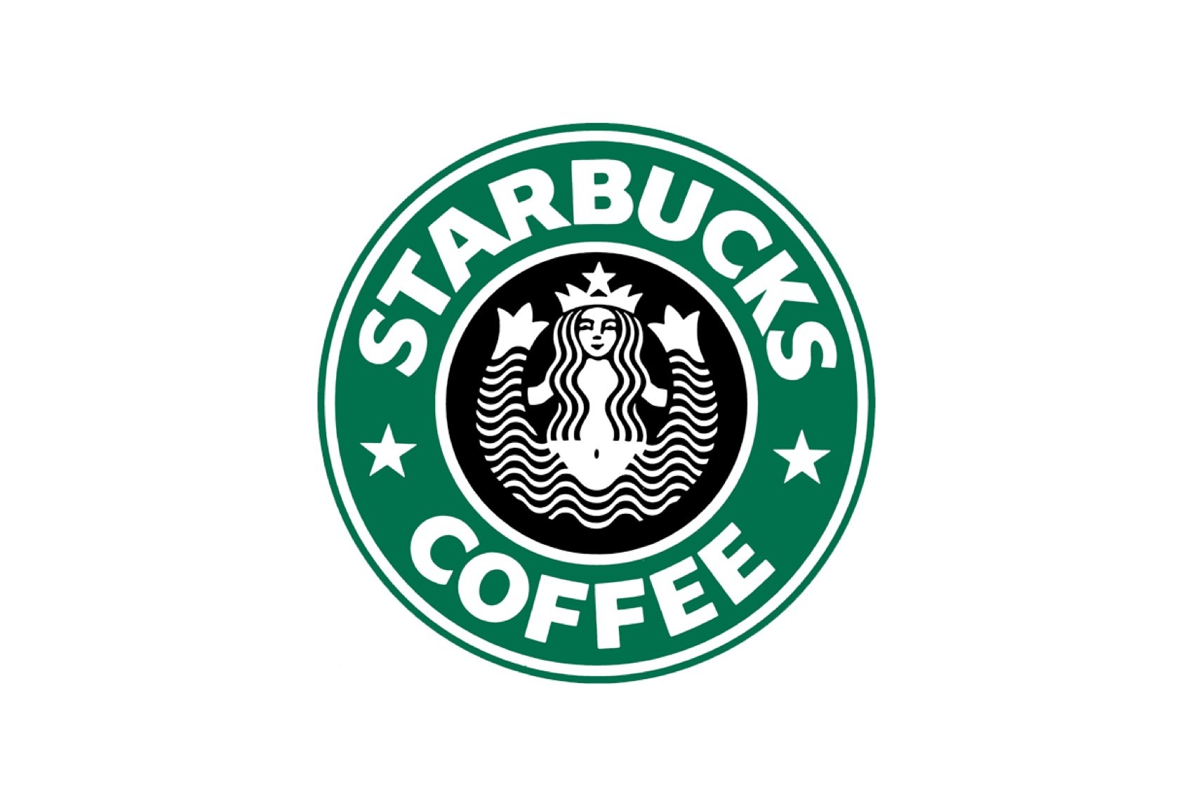
In 1987, Starbucks underwent a significant logo redesign to reflect the company's expansion beyond its original offerings. The new logo maintained the siren as the central figure but simplified the design for a cleaner and more modern appearance.
The updated logo replaced the brown color scheme with a more eye-catching green, symbolizing growth and freshness. The surrounding text was altered to read "Starbucks Coffee," emphasizing the company's primary focus on coffee. The siren's appearance was also modestly refined, with her fishtails partially covered by a flowing ribbon.
This bold transformation played a vital role in shaping Starbucks' brand identity, establishing the company as a contemporary and innovative player in the coffee industry.
A New Era of Simplicity: Second Major Evolution (1992)
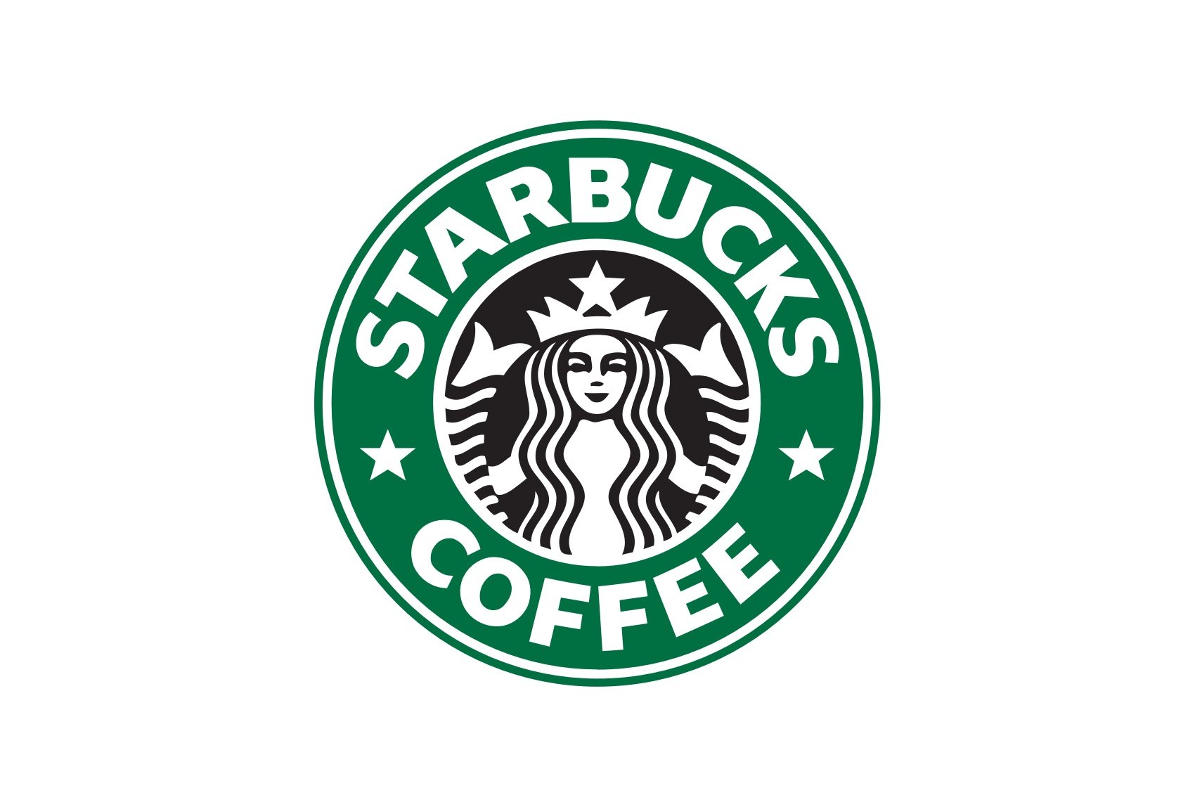
As Starbucks continued to expand its global presence, another logo evolution took place in 1992. This iteration further simplified the design, emphasizing the iconic siren while reducing visual clutter.
The revised logo removed the surrounding text entirely, allowing the siren to take center stage. Additionally, the color scheme was adjusted to feature a deeper shade of green, evoking a sense of stability and sophistication.
This streamlined design effectively communicated Starbucks' commitment to delivering a consistent and high-quality coffee experience, further solidifying the company's reputation as a leading coffee brand.
Embracing Minimalism: The Current Starbucks Logo (2011)
In celebration of Starbucks' 40th anniversary in 2011, the company unveiled its most minimalistic logo to date. This centennial logo design removed the siren's surrounding circle and text, focusing solely on the siren figure.
The new design emphasized the siren as a symbol of Starbucks' global presence and its commitment to offering an exceptional coffee experience in every corner of the world. The minimalist approach showcased Starbucks' confidence in the power of its brand, highlighting the siren as a universally recognizable symbol of quality.
Impact Beyond Coffee: Cultural Influence and Meaning of the Starbucks Logo

The Starbucks logo has transcended its role as a mere representation of a coffee brand. Its influence on design trends and corporate branding has been profound, inspiring countless businesses to adopt similar circular and minimalistic designs.
The Starbucks logo has also become a cultural icon, appearing in movies, TV shows, and countless social media posts. The siren has evolved into a symbol of not just coffee, but also a lifestyle that emphasizes connection, relaxation, and a sense of belonging.
The meaning behind the Starbucks logo is multifaceted. At its core, it represents the brand's commitment to delivering an exceptional coffee experience. However, it also embodies the spirit of adventure, the allure of the unknown, and the power of human connection, all of which are integral to the Starbucks brand.
Conclusion: The Everlasting Emblem of Starbucks - Past, Present, and Future
The Starbucks logo has undergone several transformations since its inception in 1971. Each evolution has served to refine and strengthen the brand's identity while adapting to changing market conditions and design trends.
Today, the Starbucks logo stands as a testament to the brand's enduring success and influence. Its simplicity, elegance, and cultural impact have made it one of the most recognizable and powerful symbols in the world. As Starbucks continues to grow and innovate, the iconic siren will undoubtedly remain at the heart of the brand, embodying its essence and guiding it towards a promising future.
If you're interested in exploring more food-related logos and their evolution, be sure to check out our "food logo design" page. There, you'll find a showcase of famous food logos, from McDonald's to Coca-Cola, and gain a deeper understanding of the power of visual branding. Thank you for joining us on this journey through the history and evolution of the Starbucks logo!
Inspired by the Starbucks logo evolution and its impact on branding? If you're looking to create a unique and powerful logo for your own business, try our logo maker today. Our intuitive platform offers a wide range of design options and customizations to help you craft the perfect logo that represents your brand identity and leaves a lasting impression.
Disclaimer: Logomaster.ai is not affiliated with any of the companies whose logos are featured in this blog post. The logos are used for educational and inspirational purposes only. All trademarks and registered trademarks are the property of their respective owners.
References
- Starbucks Creative Expression (https://creative.starbucks.com)
- Wikipedia (https://en.wikipedia.org/wiki/Starbucks)
Share this
Create your logo now
Get 100+ logo ideas instantly. Professional logo ready in 5 minutes, not days.
Try it for free →You May Also Like
These Related Stories
The Evolution of the Ajax Logo: Dutch Football Heritage

Chevrolet Logo: Evolution and Symbolism of a Timeless Emblem

Facebook Logo: Unveiling the Evolution and Significance
Create your own logo now
Create and edit logos with ease, no design skills required.