Share this
Samsung Logo Evolution: A Journey of Innovation and Identity
by Logomaster Team on Oct 9, 2023
In the dynamic world of technology and consumer electronics, few names resonate as strongly as Samsung. Beyond its innovative products, the Samsung logo stands as a testament to the brand's journey, values, and vision. A logo is more than just a graphic—it's a visual embodiment of a company's identity and legacy.
History of the Logo
Early Beginnings and Symbolic Roots

Amidst the dusty annals of history, Samsung's origins were humble, but its aspirations were vast. The early logo, resembling a patchwork quilt of stars, stripes, and wheat plants inside a circle, reflected its modest past. But beyond aesthetics, this emblem concealed a rich symbolism. The stars, intricately connected with the brand's name meaning "tri-star" in Korean, alluded to power, excellence, and greatness. The inclusion of wheat plants was a nod to the company's agrarian beginnings, laying the foundation for a symbol that encapsulated both tradition and ambition.
A Symbolic Shift to Modernity
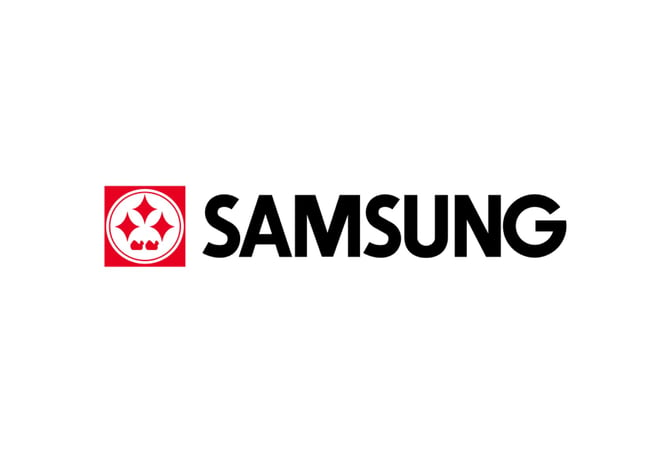
As the world transitioned to black and white screens, so did Samsung's logo evolve. The three stars, once intricate, now appeared refined, abstract, and more universally relevant. Accompanied by the "Samsung" wordmark in bold black, the logo heralded the brand's global aspirations. The cluttered elements were stripped away, creating a more streamlined and recognizable identity. This transition paralleled the company's technological advancements, symbolizing the journey from local to global player.
Streamlined Design and Global Recognition
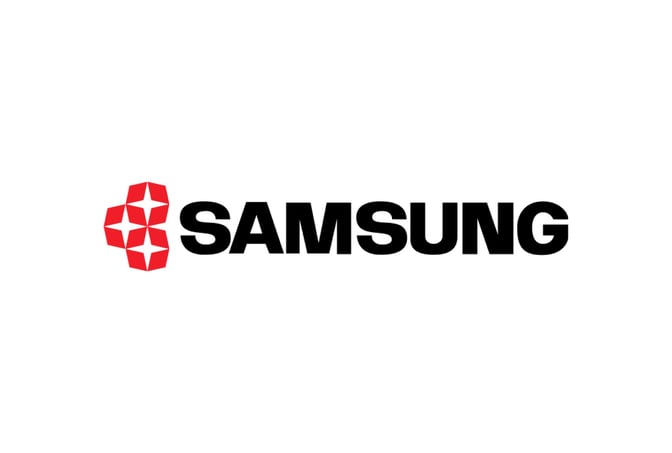
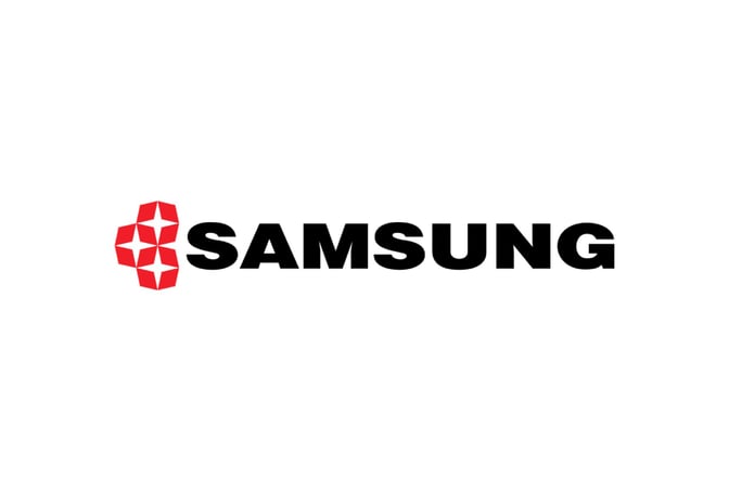
In the 1970s, a remarkable transformation took place. The circle and square receded into history, allowing the stars and brand name to shine unobstructed. This design evolution represented Samsung's pursuit of innovation and its commitment to technological excellence. The intricate star design transformed into a streamlined motif, harmoniously blending with the brand name. The deft use of negative space added sophistication and modernity to the emblem, marking a visual leap forward.
The Birth of an Iconic Identity
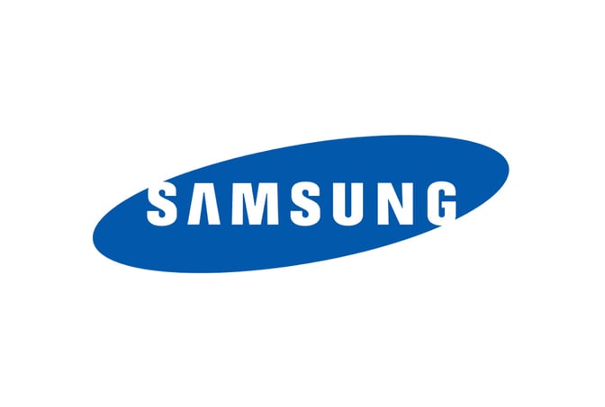
The year 1993 marked a turning point, introducing the world to the iconic Samsung logo we know today. Bold sans serif letters, embraced within a blue ellipse, created a powerful and modern identity. The most remarkable feature—the "A" without the horizontal bar—elevated the emblem's uniqueness. This design underscored Samsung's ability to balance tradition and innovation, building a bridge between its past and its future.
Modern Adaptations and Versatility
In 2005, the design team made a strategic decision. The ellipse was dismissed, allowing two versions of the logo to coexist—the elliptical one and its unencumbered counterpart. This choice epitomized Samsung's adaptability and versatility. Just as their products evolve to meet diverse consumer needs, their logo demonstrates the brand's capacity to thrive in various contexts.
The Significance of Design Elements
Three Stars

The three stars in the Samsung logo aren't mere ornaments; they encapsulate the essence of the brand. These stars symbolize the "tri-star" name, connecting the past, present, and future. They whisper of excellence, power, and greatness, echoing the aspirations that have driven Samsung's journey.
Color Palette
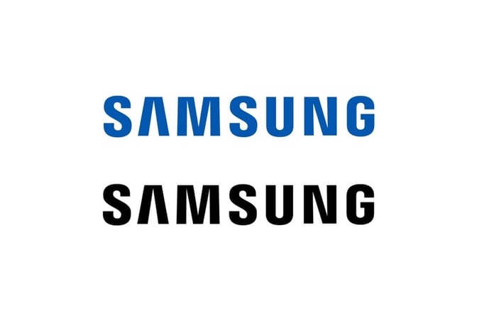
The color blue, a cornerstone of the logo's palette, carries profound symbolism. It's a hue of trust, reliability, and technology—a color that reassures and captivates. The variations in black and white provide versatility, accommodating diverse applications while retaining the brand's integrity.
Wordmark and Typography

"Samsung," the wordmark that accompanies the emblem, isn't just a label—it's a global statement. The sans-serif font is a choice that speaks of modernity, professionalism, and simplicity. The absence of serifs signifies progress, reflecting the company's evolution towards sleekness and streamlined efficiency.
Conclusion
As we journey through Samsung's logo evolution, we discover more than just design changes. The logo stands as a testament to the brand's values, its history, and its identity. It's a dynamic symbol that encapsulates the spirit of innovation, adaptability, and global reach. The Samsung logo proves that beneath the surface of a simple image lies a profound representation of a company's legacy, aspiration, and unwavering commitment to excellence.
For more tech logo inspiration, you can also explore Free Tech Logo Maker & Top Ideas from Famous Tech Companies.
To explore more inspiring logo designs across various industries and styles, check out our collection of logo ideas. Whether you're seeking inspiration for your own logo or simply appreciate the artistry behind effective branding, our logo ideas showcase the creative possibilities in the world of design. Discover the power of visual identity and unleash your brand's potential with a captivating logo that captures the essence of your business or organization.
Disclaimer: Logomaster.ai is not affiliated with any of the companies whose logos are featured in this blog post. The logos are used for educational and inspirational purposes only. All trademarks and registered trademarks are the property of their respective owners.
Share this
Create your logo now
Get 100+ logo ideas instantly. Professional logo ready in 5 minutes, not days.
Try it for free →You May Also Like
These Related Stories
Intel Logo: Evolution, Symbolism, and Impact

The Apple Logo Evolution: From Fruit to Iconic Symbol

Adobe Logo: Evolution of Innovation and Identity
Create your own logo now
Create and edit logos with ease, no design skills required.