Share this
The Evolution of Microsoft Logo: Tracing Innovation Through Time
by Logomaster Team on Oct 7, 2023
In the ever-changing landscape of technology, where innovation is the driving force, logos hold a special place. One emblem that has become a hallmark of the tech realm is the Microsoft logo. As a towering presence in the world of information technology, Microsoft's logo journey isn't just about design changes; it's a visual narrative that captures the company's growth, the industry's evolution, and the essence of technological progress.
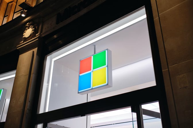
History of the Logo
A Humble Beginning
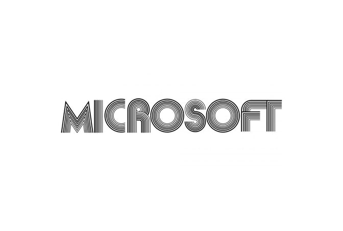
The Microsoft logo's journey started in the mid-1970s, a time when the tech world was finding its feet. The inaugural logo, simple and unassuming, embodied the company's birth in a garage—a nod to the modest origins from which a tech giant would emerge.
Embracing the '80s Vibe
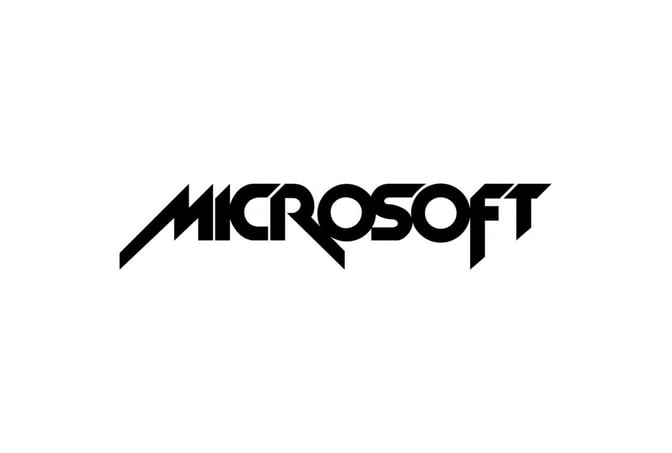
With the dawn of the 1980s, a seismic shift rocked the logo. It morphed to reflect the era's boldness and excitement, mirroring the arcade games and sci-fi culture that captivated the world. The redesigned logo wasn't just a design change; it was a statement—a proclamation of Microsoft's emergence as a tech trailblazer.
The Identity Transition
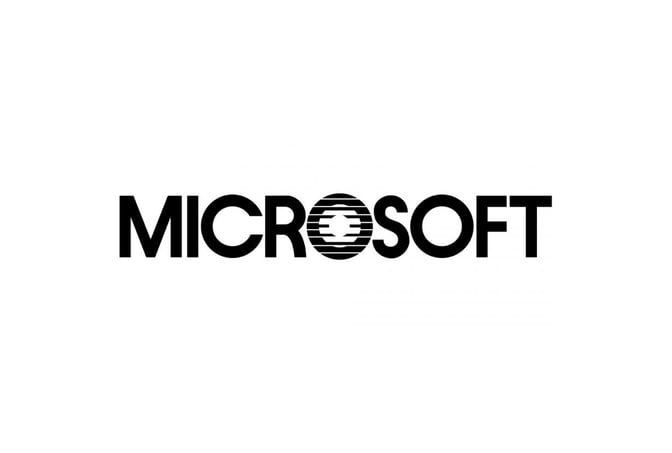
The '80s eventually gave way to the '90s, marked by a shift towards simplicity. The logo's makeover spoke volumes about Microsoft's evolution from its vibrant beginnings. The transition to a straightforward sans-serif typeface marked the company's gradual transformation into a tech juggernaut.
The Iconic Era
The year 1987 marked the dawn of an iconic era for Microsoft's logo. This design encapsulated the brand's identity and perspective. The introduction of the triangular white cut in the letter "O" was no mere typographic element. It was a symbol—a bridge between "Micro" and "Soft." It reflected Microsoft's unique vantage point in the tech universe.
A Subtle Shift

Even icons evolve. In 2011, Microsoft's logo saw subtle tweaks—refinements in proportions and spacing that modernized the design while preserving its essence. This shift underscored the brand's unwavering commitment to staying relevant in an ever-changing landscape.
The Contemporary Vision
Then came the year 2012—a year of significant change. Microsoft embarked on a rebranding journey that birthed the contemporary logo we know today. A geometric icon composed of colorful squares emerged, symbolizing the brand's myriad facets. The logotype, in a clean and modern sans-serif typeface, spoke to Microsoft's commitment to clarity, simplicity, and innovation.
The Significance of Design Elements
The Triangular Cut
The iconic triangular cut in the letter "O" isn't just a design quirk; it's a profound symbol. It embodies the balance that Microsoft strikes between the "Micro" and the "Soft." It encapsulates the paradox of technology—powerful yet accessible, complex yet user-friendly. This element isn't just a visual curiosity; it's a declaration of Microsoft's ethos.
The Colorful Squares
The squares in the contemporary logo aren't random geometry; they're profound representations. Each square signifies a facet of Microsoft—a diverse portfolio of products and innovations. These squares are more than shapes; they're vibrant carriers of Microsoft's legacy and promise.
The Typeface Evolution
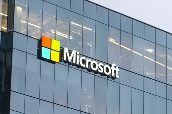
From the rounded serif typeface of the company's infancy to the crisp, modern sans-serif typeface of today, the evolution of the logo's typography is a journey of growth. The transformation reflects not just design shifts but Microsoft's transformation from a fledgling startup to a global tech behemoth.
Conclusion
The Microsoft logo isn't just a visual identifier; it's a chronicle of growth, innovation, and transformation. Each design iteration is a chapter in Microsoft's journey—a testament to its resilience and adaptability. From its humble origins to its iconic status, the logo narrates not only Microsoft's story but also the evolution of the tech industry itself. It captures the past, defines the present, and hints at the exciting future that technology holds.
For more tech logo inspiration, you can also explore Free Tech Logo Maker & Top Ideas from Famous Tech Companies.
To explore more inspiring logo designs across various industries and styles, check out our collection of logo ideas. Whether you're seeking inspiration for your own logo or simply appreciate the artistry behind effective branding, our logo ideas showcase the creative possibilities in the world of design. Discover the power of visual identity and unleash your brand's potential with a captivating logo that captures the essence of your business or organization.
Disclaimer: Logomaster.ai is not affiliated with any of the companies whose logos are featured in this blog post. The logos are used for educational and inspirational purposes only. All trademarks and registered trademarks are the property of their respective owners.
Share this
Create your logo now
Get 100+ logo ideas instantly. Professional logo ready in 5 minutes, not days.
Try it for free →You May Also Like
These Related Stories
The Apple Logo Evolution: From Fruit to Iconic Symbol

Facebook Logo: Unveiling the Evolution and Significance
Google Logo: Its Evolution and Significance Over the Years
Create your own logo now
Create and edit logos with ease, no design skills required.