Share this
IBM Logo Evolution: Symbolizing Progress and Reliability
by Logomaster Team on Oct 12, 2023
In the realm of information technology, one name stands tall: IBM. Beyond its technological prowess, IBM's logo tells a tale of evolution, resilience, and values. A symbol that transcends time, the IBM logo is more than just a visual identity; it encapsulates the company's journey and aspirations.
History of the Logo
From Humble Beginnings to Corporate Fusion
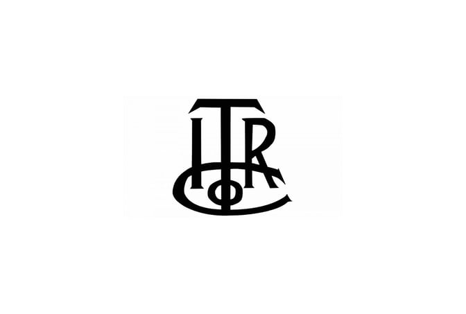
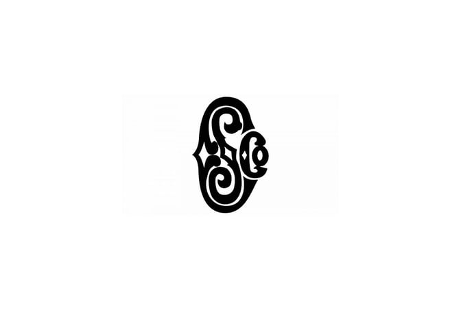
In the late 19th century, two companies, International Time Recording Company and Computing Scale Company, merged to form IBM. The initial logos, an elegant ITRCo monogram and an ornate CSCo lettering, whispered of the brand's nascent elegance.
The Unification and Global Aspirations

1910 brought the union of these two entities into the Computing-Tabulating-Recording Company, marked by a sleek monogram within a thin circular frame. The emblem symbolized unity and precision, a precursor to IBM's global ambitions.
A Bold Transition to International Business
By 1924, the company rebranded as International Business Machines, unveiling a bold globe logo. With the words "Business" and "Machines" in black, separated by a white "equator," the logo conveyed IBM's readiness to conquer international markets.
Simplicity and Solidity
Post-World War II, in 1947, the logo transformed into a minimalist blue logotype. The square, massive serif typeface radiated a sense of calm solidity, echoing IBM's reputation for trustworthiness.
Refinement and Modernization
In 1956, subtle changes brought elongated serifs and emphasized negative space to the logo. This refresh captured IBM's evolution while retaining its core identity.
Striking Stripes and Iconic Change
A groundbreaking shift occurred in 1967, when the iconic striped IBM logo was introduced. The blue inscription, divided into 13 equal strips, depicted IBM's dynamic nature and adaptability.
Confidence and Impact
Five years later, in 1972, the logo evolved again. Reduced to eight stripes and embracing a bolder appearance, it emanated confidence and strength, mirroring IBM's ever-growing influence.
The Significance of Design Elements
The Globe: Pioneering Global Reach
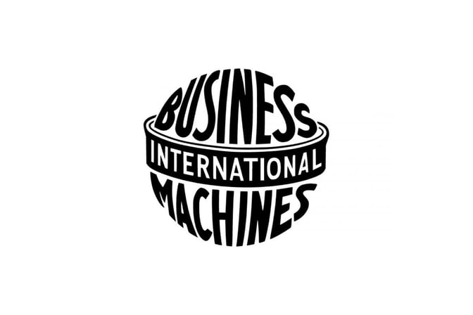
The globe is not just a design element but a representation of IBM's global reach. It symbolizes the company's commitment to transcending borders and serving a worldwide audience.
Serif Typeface: A Beacon of Reliability
The serif typeface, even through iterations, remains constant. It speaks of IBM's unswerving reliability, anchoring its position as a trusted partner in the technology landscape.
Stripes: A Journey of Innovation
The iconic stripes signify more than aesthetics. They reflect IBM's journey through time, representing its relentless pursuit of innovation and progress.
Color Palette: Blueprints of Trust
The blue hue in the logo's color palette isn't arbitrary. It evokes trust, instilling a sense of reliability in IBM's offerings and fostering strong connections with its audience.
Conclusion
As we journey through IBM's logo evolution, we uncover not just design changes, but a narrative of growth, adaptability, and values. The IBM logo stands as a testament to the power of visual identity in conveying a brand's journey, aspirations, and unwavering commitment to its audience. Through each transformation, the logo tells a story that resonates across time, a story of a company that shaped technology and the world around it.
For more tech logo inspiration, you can also explore Free Tech Logo Maker & Top Ideas from Famous Tech Companies.
To explore more inspiring logo designs across various industries and styles, check out our collection of logo ideas. Whether you're seeking inspiration for your own logo or simply appreciate the artistry behind effective branding, our logo ideas showcase the creative possibilities in the world of design. Discover the power of visual identity and unleash your brand's potential with a captivating logo that captures the essence of your business or organization.
Disclaimer: Logomaster.ai is not affiliated with any of the companies whose logos are featured in this blog post. The logos are used for educational and inspirational purposes only. All trademarks and registered trademarks are the property of their respective owners.
Share this
Create your logo now
Get 100+ logo ideas instantly. Professional logo ready in 5 minutes, not days.
Try it for free →You May Also Like
These Related Stories
Intel Logo: Evolution, Symbolism, and Impact

Amazon Logo: Evolution, Symbolism, and Impact on Brand Identity
Adobe Logo: Evolution of Innovation and Identity
Create your own logo now
Create and edit logos with ease, no design skills required.
