Share this
Google Logo: Its Evolution and Significance Over the Years
by Logomaster Team on Oct 6, 2023
In the ever-expanding digital landscape, one name stands as a beacon of innovation and knowledge: Google. This global tech titan, synonymous with internet searches and cutting-edge technology, owes much of its recognition to its iconic logo. A logo is more than a mere image; it's the visual embodiment of an organization's values, history, and identity. In the case of Google, its logo is not just a design; it's a narrative that has evolved over the years, capturing the essence of one of the world's most influential companies.

History of the Logo
Inception: A Humble Start
In the mid-1990s, two Stanford University students, Sergey Brin and Larry Page, conceived the idea of a revolutionary search engine. They aptly named it "BackRub." The logo of this nascent endeavor was a simple, red wordmark, a glimpse into the playful spirit that would characterize Google. Eventually, the company metamorphosed into Google, and with that transformation came the birth of a logo that would change the digital landscape forever.
A Palette of Colors: The Growing Identity
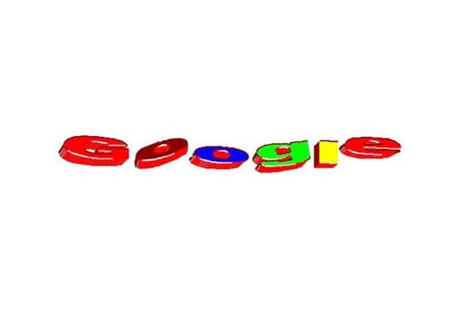
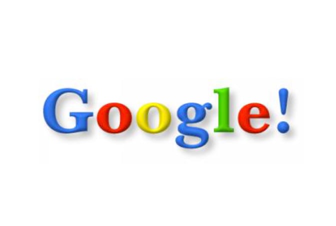
The birth of Google's iconic logo happened in 1997. Playful and colorful, the three-dimensional jumping letters heralded a brand that didn't shy away from embracing the vibrant spectrum of possibilities. The exclamation mark added a dash of excitement, encapsulating Google's bold pursuit of innovation. Over the years, the logo grew dimensionally, evolving while retaining its core identity.
Elegance and Refinement: The Pursuit of Minimalism
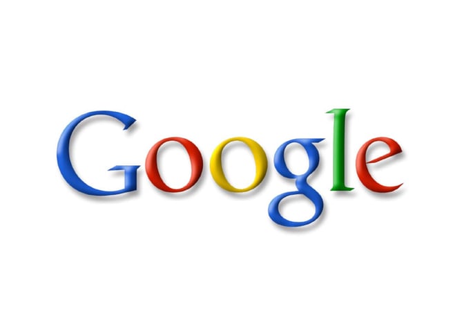
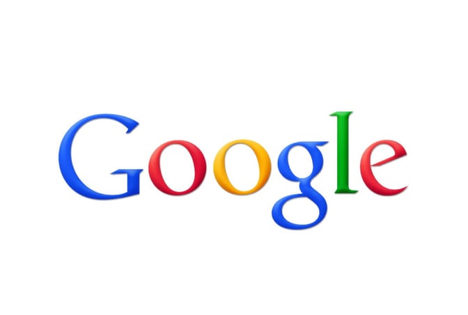
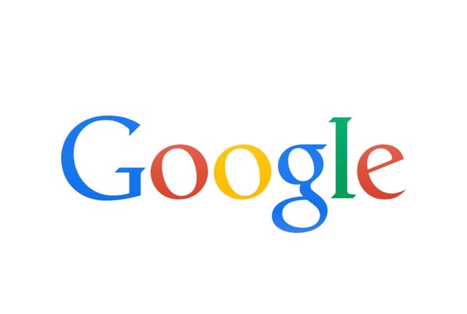
The transition to the 2D logo marked Google's embrace of a more sophisticated identity. The Catull BQ serif font entered the stage, bringing an air of elegance and solid lines. The serifs and subtle incline of the "O"s added character, showcasing Google's commitment to detail. With time, Google's logo evolved from a playfully animated concept to a streamlined representation of a tech giant's aspirations.
The Bold Leap: A Modern Era
![]()
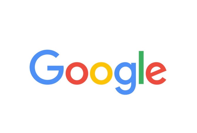
In 2015, Google made a bold declaration. The iconic multi-colored serif letters made way for a new emblematic era. The introduction of Product Sans, a bold sans-serif typeface exclusively crafted for Google, signaled a shift towards a modern, clean aesthetic. The departure from inclined letters was dramatic, and the iconic "G" symbol emerged as a dynamic emblem, signifying unity in diversity.
Today, Google's logo stands as a testament to the company's evergreen identity. With a sans-serif typeface tailored for mobile devices, the logo's legibility remains paramount. Yet, amidst this evolution, the primary color palette remains constant. The colors aren't just visually appealing; they're a reflection of Google's dynamic spirit and its commitment to innovation.
The Significance of Design Elements
Color Palette: Vibrancy and Innovation

Google's primary color palette—red, blue, yellow, and green—speaks volumes about the brand's essence. Each color represents a facet of Google's multi-faceted approach. Red signifies boldness, blue embodies stability and trust, yellow exudes optimism, and green represents growth and vibrancy. These colors aren't just a visual choice; they're an embodiment of Google's unwavering commitment to innovation and change.
Typography: A Journey Through Fonts

The evolution of Google's typography from a playful wordmark to the refined elegance of Product Sans is a testament to the company's growth. Fonts aren't just about aesthetics; they're about communication. Google's chosen typefaces have evolved in tandem with its mission. They are a testament to readability, modernity, and the tech prowess that defines Google.
"G" Symbol: A Bold Emblem

The iconic "G" symbol introduced in 2015 is more than just a letter; it's an emblematic representation of Google's unified diversity. The four colors in the "G" mirror Google's services—diverse yet united. This bold emblem is more than just a visual element; it's a statement that encapsulates Google's role as a catalyst for diverse innovation.
Conclusion
The Google logo isn't just an image—it's a narrative. It tells the story of a journey from vibrant playfulness to modern elegance. It encapsulates Google's core values—innovation, diversity, and reliability. In its simplicity, the logo manages to convey the dynamic spirit of a tech giant that has transformed the way the world interacts with information. As Google continues to innovate, its logo will remain a timeless representation of the company's ever-evolving identity.
For more tech logo inspiration, you can also explore Free Tech Logo Maker & Top Ideas from Famous Tech Companies.
To explore more inspiring logo designs across various industries and styles, check out our collection of logo ideas. Whether you're seeking inspiration for your own logo or simply appreciate the artistry behind effective branding, our logo ideas showcase the creative possibilities in the world of design. Discover the power of visual identity and unleash your brand's potential with a captivating logo that captures the essence of your business or organization.
Disclaimer: Logomaster.ai is not affiliated with any of the companies whose logos are featured in this blog post. The logos are used for educational and inspirational purposes only. All trademarks and registered trademarks are the property of their respective owners.
Share this
Create your logo now
Get 100+ logo ideas instantly. Professional logo ready in 5 minutes, not days.
Try it for free →You May Also Like
These Related Stories
Intel Logo: Evolution, Symbolism, and Impact

Facebook Logo: Unveiling the Evolution and Significance

Adobe Logo: Evolution of Innovation and Identity
Create your own logo now
Create and edit logos with ease, no design skills required.