In the vast landscape of social media, there stands an icon that needs no introduction: Facebook. A digital realm where connections are made, memories are shared, and the world gets a glimpse into the lives of others. At the heart of this global phenomenon lies a seemingly simple yet incredibly powerful symbol - the Facebook logo. In this journey through time and design, we'll unravel the evolution and significance of this iconic emblem.

History of the Logo
From Humble Beginnings to Global Icon
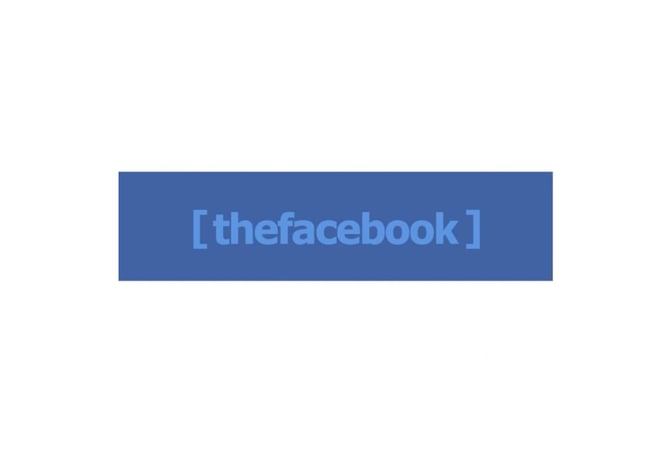
Back in the early days of its existence, Facebook started as "TheFacebook." The logo, donning a solid wordmark within brackets, reflected the platform's origins as a college networking experiment. As it broke the chains of campuses and transcended borders, it underwent a transformation that mirrors its expansive journey.
Simplicity and Stability
In the quest for recognition and simplicity, the logo evolved into the lowercase "facebook" emblazoned on a blue rectangle. This unassuming design has remained largely unchanged over the years, a testament to the power of consistency. Minor tweaks have been made, a shade here, a size there, all in the pursuit of refining an already impactful emblem.
Design Evolution without Drastic Changes
What's remarkable about the Facebook logo is not its ever-changing nature, but rather its stability. As the platform itself morphed and grew, the logo acted as a steadfast anchor, a beacon of familiarity in the ever-shifting digital landscape.
The Significance of Design Elements
Blue and White Color Scheme
Blue and white - the colors that speak volumes without uttering a word. The selection of blue isn't just a coincidence. It's a deliberate choice that paints the canvas of Facebook with shades of purity, optimism, and modernity. The blue background beckons users to explore a clean and boundless digital realm.
Lowercase Font and Casual Impression
A friendly nod to informality, the lowercase font in the logo has become synonymous with the easy-going spirit of Facebook. People don't log in here to be formal; they come for leisure and connections. The lowercase letters serve as a welcoming handshake, inviting users to join a global community without pretenses.
The Stability of Recognition
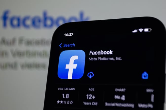
In a world where trends come and go like fleeting whispers, the Facebook logo stands strong. This resilience isn't accidental; it's strategic. The logo's unchanging nature acts as a lighthouse in the stormy sea of digital transformations. It's a symbol that users can trust and easily identify, regardless of the platform's evolution.
Conclusion
The Facebook logo is more than just a visual mark; it's a bridge between the past, present, and future of social networking. It encapsulates the journey from a college experiment to a global powerhouse, all while embracing its core values. Blue and white hues whisper tales of optimism and purity, while the lowercase font extends an invitation to a world of connections. This unassuming emblem, standing strong amid change, is a testament to the enduring power of design in shaping the identity of a modern digital giant.
For more tech logo inspiration, you can also explore Free Tech Logo Maker & Top Ideas from Famous Tech Companies.
To explore more inspiring logo designs across various industries and styles, check out our collection of logo ideas. Whether you're seeking inspiration for your own logo or simply appreciate the artistry behind effective branding, our logo ideas showcase the creative possibilities in the world of design. Discover the power of visual identity and unleash your brand's potential with a captivating logo that captures the essence of your business or organization.
Disclaimer: Logomaster.ai is not affiliated with any of the companies whose logos are featured in this blog post. The logos are used for educational and inspirational purposes only. All trademarks and registered trademarks are the property of their respective owners.