Share this
BMW Logo Evolution: History and Symbolism
by Logomaster Team on Aug 8, 2023
In the world of automobiles, few names command the respect and admiration that BMW does. Beyond the power of its engines and the elegance of its designs lies a symbol that encapsulates the brand's essence - the BMW logo. This emblem, like a time capsule, tells the story of BMW's journey from its humble beginnings to its status as a symbol of elite transport and innovation.

History of the Logo:
From RAPP to BMW: A Legacy Takes Shape
Amid the echoes of the early 20th century, RAPP Motorenwerke embarked on a journey that would eventually lead to the iconic BMW logo we know today. The logo, once simple and unassuming, evolved alongside the company's transformation into Bayerische Motoren Werke (BMW), marking a significant shift in the brand's identity.
The Dixi Era: A New Chapter Begins
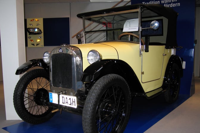
BMW Dixi 3/15 DA (LSDSL, CC BY-SA 2.0 DE , via Wikimedia Commons)
In the annals of automotive history, the introduction of the Dixi marked the beginning of BMW's legacy. This compact yet high-speed vehicle redefined the industry, setting the tone for BMW's commitment to innovation. The logo now held not just the company's name, but the promise of a new era in transportation.
The Iconic Blue and White Checkered Insignia: Heritage in Design
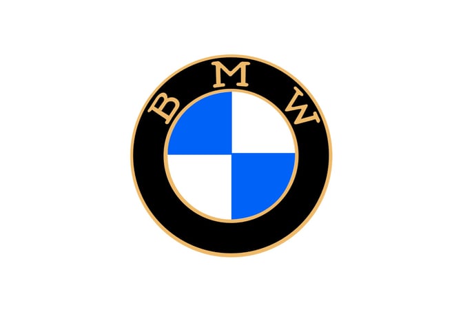
It was in 1917 that the logo embraced its iconic blue and white checkered pattern. Like the Bavarian flag, this design choice was no accident; it was a visual tribute to BMW's origins. The logo was no longer just an identifier; it had become a storyteller, narrating the brand's journey through time.
Modernization and Refinement: Reflecting Progress
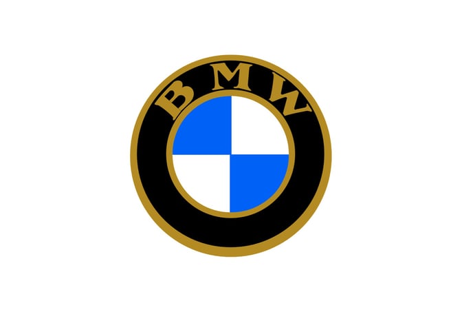
In 1933, the logo underwent a transformation, reflecting the brand's evolution and commitment to staying relevant. The design shifted, lines became bolder, and typefaces evolved, reflecting a company that was maturing alongside its products.
A Silver Reflection of Progress: The 1953 Shift
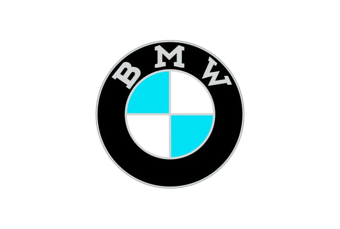
The evolution continued in 1953 with a shift from gold to silver. This change wasn't merely cosmetic; it mirrored BMW's pursuit of progress. The logo's elements became sleeker, and the silver elements evoked a sense of modernity.
The Balanced Modern Look: Defining an Era
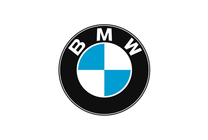
1963 saw the logo's transition into a perfectly balanced modern emblem. Clean lines, a white sans-serif font, and a sense of authority defined this era. The logo's visual language now communicated BMW's status as an automotive authority.
The Emblem of the Late 20th Century: Lasting Legacy
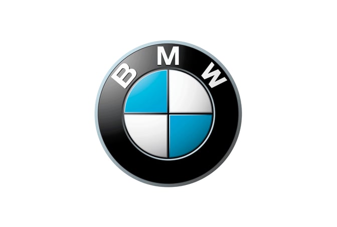
In 1997, the logo's iconic three-dimensional circle emerged, embodying decades of legacy. Blue and white patterns, distinct yet harmonious, became the symbol of BMW's journey, encapsulating its identity and heritage.
Embracing Minimalism: A Contemporary Shift
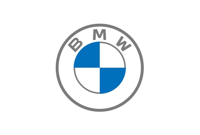
2020 marked a turning point as the logo shifted towards minimalism. The removal of black color and the introduction of a sleek 2D design signaled BMW's readiness for the future. The logo no longer just reflected history; it represented the brand's progress.
The Significance of Design Elements:
Blue and White Checkered Pattern: A Homage to Origins
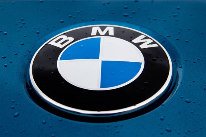
The blue and white checkered pattern isn't just a design; it's a tribute to Bavaria, BMW's birthplace. It's a reminder of the brand's roots and a visual connection to its heritage.
Circle and Framing: Unity in Continuity

The circular shape and framing of the logo symbolize BMW's unity and continuity. Just as the brand has persisted through time, so does its logo, encapsulating its unwavering commitment.
The "BMW" Wordmark: Typographic Authority
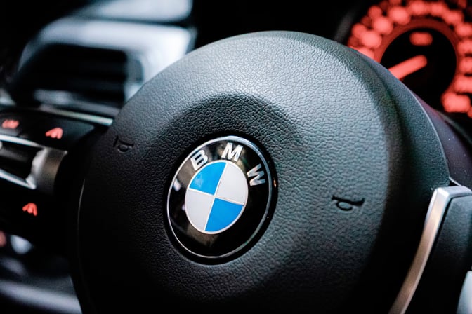
The "BMW" wordmark isn't just a name; it's a statement of authority. The font's evolution through the years mirrors BMW's transformation, reflecting its modernity, quality, and value.
Conclusion
As we journey through BMW's logo history, we uncover not just a visual evolution, but a narrative of progress, innovation, and identity. The logo has not only marked the passage of time but also encapsulated BMW's commitment to pushing boundaries and embracing change. The emblem tells a story of an enduring legacy, mirrored in metal, that has and will continue to speed into the future.
For more automotive logo inspiration, you can also explore Free Automotive Logo Maker & Top Ideas from Famous Brands.
To explore more inspiring logo designs across various industries and styles, check out our collection of logo ideas. Whether you're seeking inspiration for your own logo or simply appreciate the artistry behind effective branding, our logo ideas showcase the creative possibilities in the world of design. Discover the power of visual identity and unleash your brand's potential with a captivating logo that captures the essence of your business or organization.
Disclaimer: Logomaster.ai is not affiliated with any of the companies whose logos are featured in this blog post. The logos are used for educational and inspirational purposes only. All trademarks and registered trademarks are the property of their respective owners.
Share this
Create your logo now
Get 100+ logo ideas instantly. Professional logo ready in 5 minutes, not days.
Try it for free →You May Also Like
These Related Stories

Mercedes-Benz Logo: Evolution and Significance
Chevrolet Logo: Evolution and Symbolism of a Timeless Emblem
Ford Logo Evolution: From Heritage to Innovation
Create your own logo now
Create and edit logos with ease, no design skills required.