In the ever-evolving world of technology, one symbol stands out as a beacon of innovation and style - the iconic Apple logo. Synonymous with cutting-edge gadgets and a revolutionary approach to design, the Apple logo has transcended its role as a mere corporate symbol. This article takes a captivating journey through the evolution and significance of the Apple logo, unraveling the story behind its design and its lasting impact on global culture.
History of the Logo
Seeds of Simplicity
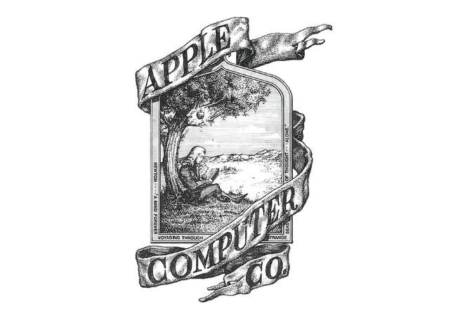
At the heart of Apple's inception in 1976, the company sported a logo that mirrored its early stages. Designed by Ronald Wayne, the logo depicted Isaac Newton under an apple tree. A ribbon-like backdrop encapsulated the scene, exuding a sense of elegance. It was a humble start, hinting at the brand's potential for growth.
The Bite that Sparked a Revolution
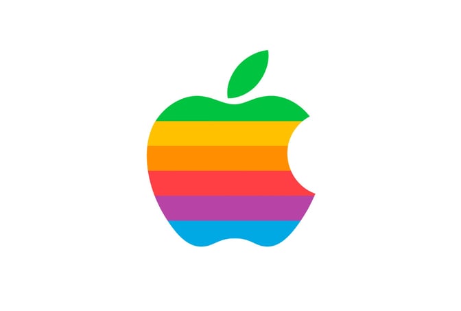
Just a year later, a transformation occurred that would alter the course of branding history. Rob Janoff's design introduced the world to the bitten Apple logo. The rainbow spectrum, an ode to the Apple II's color capabilities, symbolized the company's creative diversity. The iconic bite mark, often misconstrued, cleverly differentiated the logo from cherries and subtly hinted at "bytes" of technology.
From Color to Monochrome
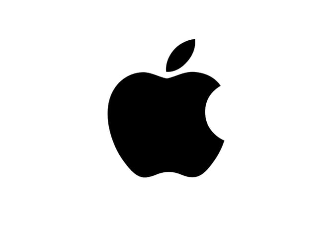
As Apple embarked on its journey into the late '90s, the logo witnessed refinement. The rainbow hues gradually gave way to the minimalist monochrome version. This transition showcased Apple's commitment to sleek design while paving the way for the next phase of its iconic logo.
The Significance of Design Elements
The Bitten Fruit

The hallmark of the logo, the bite, tells a story of innovation and exploration. Just as Eve's bite from the forbidden fruit led to enlightenment, the bite signifies Apple's unwavering pursuit of knowledge and technological breakthroughs. It's a symbol of curiosity that fuels progress.
Minimalism Redefined
The Apple logo epitomizes the beauty of minimalistic design. The clean lines and lack of unnecessary embellishments reflect Steve Jobs' preference for simplicity. In a world cluttered with complexities, the Apple logo invites users to embrace elegance and functionality.
Font and Form
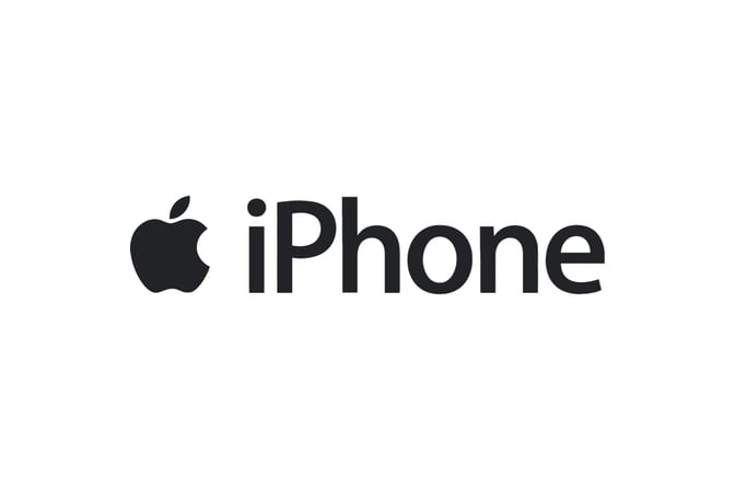
The choice of font is a deliberate stroke that harmonizes with the logo's sleekness. Myriad Pro's clean lines echo the logo's simplicity, creating a seamless integration between text and imagery. The logo's seamless blend of form and font unifies Apple's brand identity, culminating in a cohesive visual representation.
Conclusion
The Apple logo's evolution is more than a mere chronicle of design changes. It encapsulates Apple's journey from humble beginnings to becoming a global tech titan. Each design element, from the rainbow spectrum to the minimalist form, holds deeper meanings that resonate with the brand's values and aspirations. The Apple logo is more than an insignia; it's a reflection of a philosophy - a commitment to simplicity, innovation, and the pursuit of knowledge in an ever-changing world.
For more tech logo inspiration, you can also explore Free Tech Logo Maker & Top Ideas from Famous Tech Companies.
To explore more inspiring logo designs across various industries and styles, check out our collection of logo ideas. Whether you're seeking inspiration for your own logo or simply appreciate the artistry behind effective branding, our logo ideas showcase the creative possibilities in the world of design. Discover the power of visual identity and unleash your brand's potential with a captivating logo that captures the essence of your business or organization.
Disclaimer: Logomaster.ai is not affiliated with any of the companies whose logos are featured in this blog post. The logos are used for educational and inspirational purposes only. All trademarks and registered trademarks are the property of their respective owners.