Share this
by Logomaster Team on Jun 19, 2023
The Ajax Football Club, founded on March 18, 1900, in Amsterdam, is one of the most iconic and successful clubs in European football. With a rich history of triumphs and a dedicated fan base, Ajax has become synonymous with excellence and a symbol of Dutch football pride. In this article, we delve into the captivating story of the Ajax logo, tracing its evolution over time and exploring the significance of its design elements.
![]() Johan Cruyff Arena, Amsterdam (Vysotsky via Wikimedia Commons)
Johan Cruyff Arena, Amsterdam (Vysotsky via Wikimedia Commons)
History of the Ajax Logo
The Ajax logo has a rich history that reflects the club's journey and its enduring presence in Dutch football. Over the years, the logo has undergone changes and updates, evolving alongside the club's successes and adapting to the changing design trends. Let's explore the fascinating history of the Ajax logo and its significance.
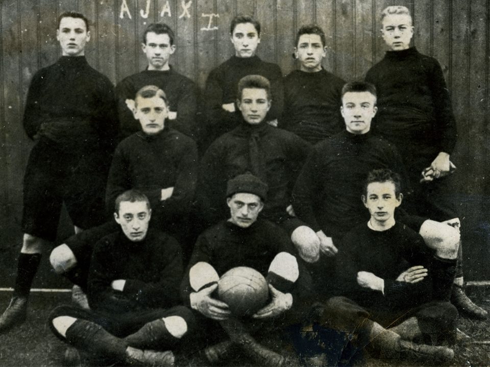 The first Ajax team, for the 1900-1901 season
The Early Years and Inaugural Logo (1900-1911)
![]()
In the early years of AFC Ajax, the club's logo featured a design that captured the essence of its identity at the time. The original logo, introduced in 1900, featured a rounded badge enclosed in a thick red frame. The badge depicted a player wearing a white uniform with a wide red vertical stripe on the jersey. Surrounding the badge was the wordmark "Amst. Football Club Ajax" in capital letters. The clean and traditional sans-serif typeface used for the wordmark added a strong and professional touch to the logo.
Evolution and Uniform Changes (1911-1928)
![]()
In 1911, the Ajax logo underwent a significant redesign alongside changes to the team's uniform. The player in the logo now sported black pants and a red and white striped jersey. The wordmark also received an update, featuring a custom sans-serif font with intriguing contours and curved vertical bars. Delicate white dots were introduced between the horizontal separating lines, adding a touch of elegance to the logo.
The Arrival of Ajax's Hero (1928-1991)
![]()
As the club's reputation and achievements grew, so did the logo's design. In the 1920s, the Ajax logo underwent a significant transformation. A profile portrait of the Greek mythological hero Ajax was introduced, symbolizing strength, determination, and the warrior spirit. The hero's image became synonymous with the club, representing its values and capturing the imagination of fans.
The detailed and ornate black and white profile of Ajax became the centerpiece of the logo. Surrounding the portrait, the wordmark "Ajax" in capital letters adorned the left side, while a small and delicate white and red crest representing the club's background and history was placed on the right side. The extended sans-serif typeface used for the wordmark, along with the gradient black and gray color scheme, created a three-dimensional and metallic appearance.
Modernization and Simplicity (1991-Present)
![]()
In 1991, the Ajax logo underwent another redesign to embrace a more modern and abstract style. The portrait of Ajax was simplified with bold contouring and the removal of extra details. The composition remained unchanged, but the lines were simplified for a cleaner look. The wordmark, now placed outside the badge on a thin red framing, adopted a modern and bold sans-serif typeface. Additionally, the logo incorporated the "Amsterdam" inscription, executed in small-size capital letters, opposite the main wordmark. This modernized logo represented the club's connection to its roots, its reverence for history and heritage, and its commitment to a minimalist and elegant visual representation.
The Significance of Design Elements in the Ajax Logo
The Ajax logo is more than just a visual representation of the club; it carries deep symbolism and significance. Each design element within the logo serves a purpose and contributes to the rich heritage and identity of AFC Ajax.
Ajax: Symbolizing Bravery and Determination
![]()
At the heart of the Ajax logo lies the depiction of Ajax, a legendary figure from Greek mythology known for his bravery and prowess in battle. This portrayal represents the club's values of strength, determination, and warrior spirit. Ajax symbolizes the relentless pursuit of victory and the unwavering commitment of the players who don the club's colors.
Unity and Teamwork: The Eleven Lines
![]()
Another significant design element within the Ajax logo is the number of players represented by the eleven lines. These lines serve as a reminder of the collective effort and teamwork required for success on the football pitch. They embody the club's philosophy of unity and collaboration, where each player's contribution is essential in achieving common goals.
Symbolic Color Palette
Red: #D2122E
White: #FFFFFF
Black: #000000
The color palette of the Ajax logo is equally symbolic. Black represents power, dominance, and the unyielding spirit of the club. White symbolizes purity, integrity, and the high standards that Ajax sets for itself both on and off the field. Red, the color of passion and energy, signifies the strong connection between the club and the vibrant city of Amsterdam.
Typography: Strength and Modernity
![]()
Typography also plays a role in the Ajax logo's significance. The bold and distinctive letterforms used in the logo convey strength and visual impact. The clean and modern sans-serif typeface reflects the club's progressive nature and commitment to staying relevant in a constantly evolving football landscape.
Conclusion
In conclusion, the Ajax logo is a powerful symbol that embodies the rich heritage and identity of AFC Ajax. It represents the club's values of strength, determination, and unity, while also reflecting its commitment to excellence in Dutch football. The Ajax logo stands as a timeless representation of the club's enduring spirit and passion, uniting players, supporters, and the community in their pursuit of success on and off the field.
For more football logo inspiration, you can also explore the top 10 football logo examples from famous European clubs.
To explore more inspiring logo designs across various industries and styles, check out our collection of logo ideas. Whether you're seeking inspiration for your own logo or simply appreciate the artistry behind effective branding, our logo ideas showcase the creative possibilities in the world of design. Discover the power of visual identity and unleash your brand's potential with a captivating logo that captures the essence of your business or organization.
Disclaimer: Logomaster.ai is not affiliated with any of the companies whose logos are featured in this blog post. The logos are used for educational and inspirational purposes only. All trademarks and registered trademarks are the property of their respective owners.